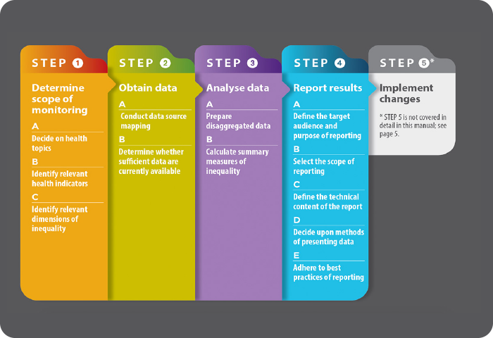
Monitoring and Analysis
 Monitoring and Analysis

Methodological Note on the Monitoring Dashboard for SDG 3 Targets, Indicators, and Inequalities
The Monitoring Dashboard for SDG 3 Targets, Indicators, and Inequalities is a tool for visualizing and tracking the evolution over time of the health indicators for Sustainable Development Goal 3 (SDG 3), assessing achievement of the targets set for 2030, and exploring the magnitude of social inequality gaps and trends, explicitly upholding the promise to “leave no one behind”.
For each selected geographical area (“Place”), each SDG 3 health “Indicator”, and each “Equity Stratifier”, the dashboard shows four basic monitoring elements: 1) general trend of the health indicator and its projection for 2030; 2) trend in absolute and relative social inequality gaps; 3) percent change in the period, average annual percent change in the general average, and absolute and relative inequality gaps between two specific years; and 4) distributive inequality of the selected health indicator according to social quintiles determined by the equity stratifier selected in the two calendar years selected by the user.
Trends in projected values. The values projected for 2030 correspond to extrapolation of the exponential model that adjusts the annualized series of observed values, according to the following equation:

where yi is the predicted value of the health indicator at the time ti, α is the intercept, β is the slope or intrinsic growth rate, and y is the Naperian base that determines the exponential function.
Trends in absolute gap. The absolute gap is a simple summary metric of health inequality; it corresponds to the arithmetic difference in the value of the health indicator between two socially determined population groups, usually at opposite ends of the social spectrum. On the dashboard, these metrics are calculated according to the following expression:

where AG is the absolute gap; HI is the health indicator; q1, the most disadvantaged social quintile, and q5 is the most advantaged quintile. The absolute gap is expressed in the same unit of measure as the health indicator; a zero (0) value for the absolute gap denotes absence of inequality.
Trends in relative gap. The relative gap is a simple summary metric of health inequality; it corresponds to the arithmetic ratio of the value of the health indicator between two socially determined population groups, usually at opposite ends of the social spectrum. In the dashboard these metrics are calculated according to the following expression:

where RG is the relative gap; HI is the health indicator; q1 is the most disadvantaged quintile, and q5 is the most advantaged quintile. The relative gap is expressed without units of measure (that is, its value represents the number of times that the numerator fits into the denominator). A relative gap value of one (1) denotes absence of inequality.
Percent change in the period. The percent change is a general progress metric over time. In the dashboard, the percent change (PC) in the magnitude of a selected health indicator (HI) in the period between year 1 (t1) and year 2 (t2) is calculated according to the following equation:

and is expressed in percentage points (compared to year 1).
Average annual percent change. The average annual percent change is a summary metric of the trend during a specified fixed interval and expresses the average growth rate (or decrease). In the dashboard, the average annual percent change (AAPC) in the trend for a selected health indicator (HI) during the period between year 1 (t1) and year 2 (t2) is calculated according to the following equation:

and is expressed in percentage points (by unit of time, that is, per year). In general, the value of AAPC reflects the speed of change of a health indicator over time. If the health indicator has negative polarity (i.e., when a lower value for the health indicator over time indicates a more favorable situation, for example, the death rate), the AAPC reflects the average annual percent decrease. If, on the contrary, the health indicator has positive polarity (this is, when a higher value of the health indicator over time indicates a more favorable situation, for example, coverage of care), the AAPC reflects the average annual percent increase.
Equiplot. An equiplot is a specific way to visualize the distribution of a health indicator in social quintiles, defined according to an equity stratifier. The dashboard has a weighted equiplot, representing the quintile distribution of the health indicator in the two years selected for comparison, with the size of the spheres proportional to the size of the population in each social quintile. The color expresses the social position gradient, from the most socially disadvantaged quintile (red) up to the most advantaged (blue). The location of each sphere (quintile) on the horizontal scale corresponds to the value of the health indicator. The spread between the spheres and, specifically the difference between the top and bottom quintiles (at the extremes of the social spectrum) reflects the magnitude of social inequality for the health indicator and its respective absolute inequality gap. For health indicators with negative polarity (such as death rates), progress over time is reflected in a shift of the distribution toward the left (toward zero on the horizontal scale). For health indicators with positive polarity (such as care coverage), progress over time is reflected in a shift of the distribution toward the right (toward universal coverage).
Country profiles


Instruments for the measurement, analysis and monitoring in health
SUSTAINABLE DEVELOPMENT GOALS 3: